¿Por qué le dan 4 estrellas a D si solo cotiza un 8% por debajo de su fair value?
1 me gusta
Bien visto Ruindog. Al tratarse de un valor con low fair value uncertainty debería cotizar a 4 estrellas con un descuento de al menos el 10%. Ahora mismo debiera cotizar con tres. Suele llevarles unos días modificar la calificación. No es la primera vez que tras caídas en el mercado veo valores a 4 estrellas que debieran figurar con 5. En este caso hace mención específica en el artículo a su descuento del 8% y por tanto no encuentro justificación.
2 Me gusta
¿Ha dejado esta gente de analizar el mercado aleman? ¿Es alguna represalia de Trump?
¿?
https://www.morningstar.com/stocks/xetr/bayn/quote
https://www.morningstar.com/stocks/xetr/sap/quote
https://www.morningstar.com/stocks/xetr/mrk/quote
Ahora a ver si nos cuentas que joyita high dividend growth andas observando por Alemania, porque es como buscar una aguja en un pajar ![]()
Las que cotizan en USA las siguen analizando pero el resto ha desaparecido: Henkel, Hugo Boss, Beiersdorf, etc
No buscaba nada en concreto, estaba haciendo un barrido aleatorio por Wall Street ![]()
1 me gusta
https://www.morningstar.com/stocks/xetr/hen3/quote
https://www.morningstar.com/stocks/xetr/boss/quote
https://www.morningstar.com/stocks/xetr/bei/quote
¿Alguien me puede indicar en que sección de la web de M* puedo encontrar estos pdfs? Gracias
Europe Large-Mid Cap Pick List
Global Large-Mid Cap Pick List
1 me gusta
Para quien no tenga la suscripcion de M*, se pueden leer los dos parrafillos de la ultima actualizacion del analista “Analyst Note” que sale cortada si pinchais con el boton derecho sobre la preview del texto y seleccionais Inspeccionar elemento (o similar dependiendo del navegador)
Ejemplo para Cisco (CSCO)
Os saldra algo como esto, algo cutre jeje
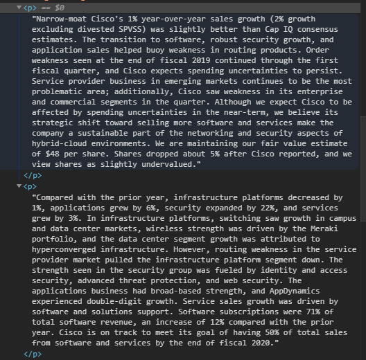
Muchas veces viene escrito el Moat y Fair Value del analista
11 Me gusta
¿Hemos perdido el acceso a las paginas del analisis cuantitativo?
¿Alguien sabe algo?
Desde esta manana no funcionan, no se por que 
prueba investing esta muy bien tambien
Me comentan de Morningstar que tienen un bug en la base de datos y que estan trabajando para arreglarlo
2 Me gusta
Una pregunta, sabéis si Morningstar suele sacar ofertas de suscripción para el Black Friday?
1 me gusta
"Reinvesting Matters! (A Great Deal)
John Rekenthaler
Dec 06, 2019
Income versus Growth
Interest receipts provide the initial investment lesson. If you are fortunate enough to possess capital, others will pay to borrow it. Money for nothing! But of course, those receipts are not free, because you have paid an opportunity cost. Others now have your funds. They may put them to work, while you may not.
Then comes capital appreciation. That understanding arrives later, because most possessions lose value over time, not gain it. Among the exceptions are real estate and stock shares. When savers accumulate enough money to buy those items, they become investors (or, less happily, speculators). Now, they possess something tangible, rather than the mere promise of future payments. They own an asset.
The most-visible investment successes come from capital appreciation alone. California properties that consume cash rather than generate it, but which are eventually sold at huge profits. Berkshire Hathaway’s equity, which has never declared a dividend. Bitcoin 2017. For purchases that don’t require ongoing investment, the math is pleasantly simple: Total return = ending price/starting price - 1.
Income With Growth
What can be difficult to comprehend, says Javier Estrada of Barcelona’s IESE Business School, is the combination of income and capital appreciation. The one greatly enhances the other, thanks to the effects of compounding. For most people, those effects are not particularly intuitive. Estrada has therefore created a chart of the S&P 500’s long-term returns, to illustrate the point.
It appears below. The green line represents the price return on the S&P 500, on a one-time purchase. Invest one dollar into the index in 1900 (never mind how), discover the Fountain of Youth, then come back in 2018 to claim your shares. They are now worth $416, because the index grew from $6.02 to $2506.85. Something, though, is missing: the dividends. The blue line depicts the value of that $1 purchase, were the S&P 500’s dividends promptly reinvested back into the index.
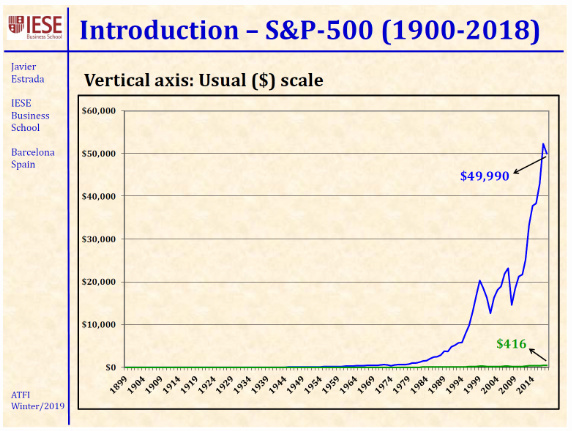
Source: Javier Estrada; IESE Business School
…
Interpret Carefully!
Also illusory is the gap between the two lines on Estrada’s chart. That chasm powerfully demonstrates his point, that reinvested dividends are critical for stock-market performance. However, it also may deceive. The instant and obvious suggestion is that the S&P 500’s income distributions dwarfed its capital growth. In fact, the opposite held. The index’s capital appreciation was the larger of the two ingredients.
This may be understood by recognizing that areas underneath the two lines multiply, not sum. One should not interpret the space under the green line as arising from appreciation, and the space between the two lines as coming from income. Rather, the entire area is a product. That is, the $416 from capital growth multiplied by the income component equals $49,990. The income component, it turns out, is $120. That figure represents the total dividends that the S&P 500 would have distributed over the time period, on a $1 initial investment.
Another of the graph’s mirages is the impression that nearly all these gains occurred over the past quarter century. Technically, that is true. The S&P 500 required 95 years to turn a $10,000 profit on a $1 investment, then 23 more years to make the next $40,000 (rounding up). The picture does not lie. But it obscures. What matters for investors how the rate of return varied over time, and on that topic the diagram is silent.
Logarithmic Improvement
Which is why logarithmic graphs were invented. Estrada’s second slide replots the returns, this time on a logarithmic scale. What a change!
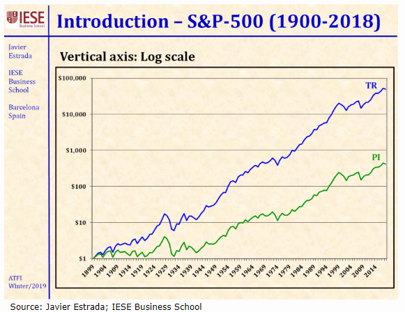
The new chart conveys two important details that were concealed by the previous graph. First, it reveals the correct relationship between the price and income returns. Each item is critical–the index’s performance would have been far, far weaker without either one–but with this picture, capital appreciation receives its just due. It was indeed the larger of the two contributors. Second, we can now see that the index’s rate of return has been consistent, at least since the late 1930s. The blue line has grown at a steady clip, pausing only briefly along the way.
(More subtly, the green capital-growth line is more volatile than the blue total-return line. This transpires not only because annual income levels are relatively stable while capital returns are not, but also because income is counter-cyclical. As stock prices drop, thereby damaging capital appreciation, income rises. To be sure, those improved yields only offer so much protection when stocks decline rapidly, but they nevertheless do pull in the opposite direction.)
…"
8 Me gusta
Mis contactos con M* estan siendo infructuosos. Me enlazan a los nuevos reportes que estan sacando pero a mi me interesa seguir viendo sus antiuguos reportes cuantitativos como este:
Por lo que veo se tienen que seguir generando de alguna manera pq este tiene fecha del 6 de diciembre
¿Alguien tiene idea de la URL para seguir viendo los antiguos informes?
@anbax, estabas suscrito a M*, no? Por qué querrías los informes cuantitativos? Los nuevos que te están dando son diferentes?
Porque los informes cuantitativos calculan un moat para todas las empresas del mundo mientras que los cualitativos solo para las que llevan expresamente sus analistas que son muchisimas menos.
A la hora de revisar acciones que no analizan viene muy bien tener el moat cuantitativo aunque no sea comparable al cualitativo.
2 Me gusta
Yo usaba el link clásico que sigue sin funcionar. El fichero de tu mensaje igual lo generan por alguna de las APIs que tienen? Nunca me he metido a mirarlas porque supongo que necesitan suscripción, mañana le echo un ojo que no estoy con el pc ahora
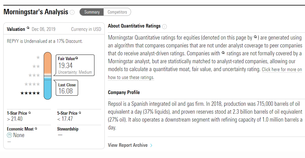
Tengo acceso a M* a través de una biblioteca americana. Cuando meto el ticker de una empresa que no tienen en seguimiento (por ejemplo el ADR de Repsol) obtengo esta información donde se incluye el moat. ¿Es esto lo que buscas?
No, eso ya lo tengo con lo que me ha pasado M*
Queria la info del informe antiguo donde al lado del moat ponen un numero de 1 a 100
1 me gusta